

First Impressions Matter: Designing a Responsive Website for Your Maida Vale Business
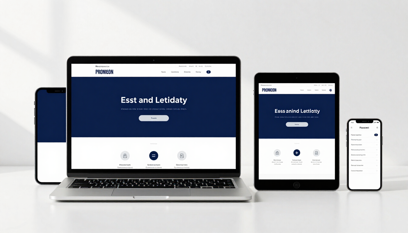
A responsive website for your Maida Vale business ensures your site looks and functions perfectly across all devices, from smartphones to desktops. By automatically adjusting layout and content, it provides a seamless user experience that builds trust, improves local SEO rankings, and secures a professional first impression.
Running a business in the heart of Maida Vale means you are operating in one of London’s most vibrant and discerning communities. Whether your customers are strolling through Little Venice or commuting via Warwick Avenue, their first point of contact with your brand is often via a smartphone. In today’s fast-paced digital economy, you don't just need a website; you need a digital presence that responds to the needs of your audience, regardless of how they choose to browse. At our Home page, we emphasise that a website is your digital storefront, and just like a physical shop on Elgin Avenue, it needs to be welcoming, accessible, and impeccably designed.
Why is responsive design vital for local businesses in Maida Vale?
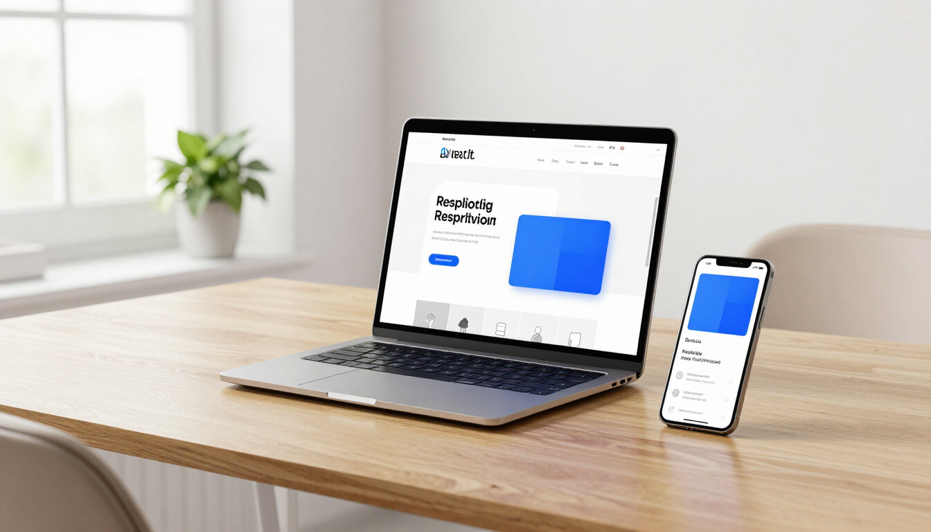
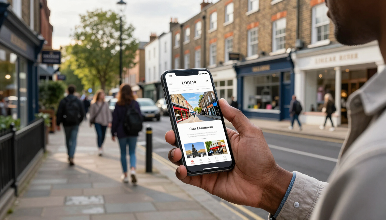
Responsive design is no longer a luxury for small to medium-sized businesses; it is a fundamental requirement. The primary reason is the sheer variety of devices used by modern consumers. Your potential customers in West London are using everything from the latest iPhones to widescreen iMacs. A responsive website uses fluid grids and flexible images to ensure that your text is readable and your buttons are clickable without the user needing to pinch or zoom. If a resident in Maida Vale searches for a local service while walking their dog in Paddington Recreation Ground, they expect a site that loads instantly and provides the information they need in a thumb-friendly format.
Furthermore, responsiveness directly impacts your brand’s perceived authority. When a site looks broken or outdated on a mobile device, users immediately associate that lack of care with the quality of your services. In a competitive area like Central London, you cannot afford to let a technical oversight drive potential clients toward a competitor who has invested in a modern Websites solution. A seamless transition between devices creates a narrative of reliability and technological proficiency that resonates with the high standards of the local community.
How does a mobile-friendly site improve your Google ranking?
Google has officially shifted to mobile-first indexing, which means the search engine primarily uses the mobile version of your content for indexing and ranking. If your Maida Vale business lacks a responsive framework, your visibility in search results will suffer, even for users searching on desktop computers. For those looking to dominate local search, having a site that adheres to SEO best practices is non-negotiable. Google prioritises user experience, and responsiveness is a top-tier signal that your site is helpful to the end-user.
Beyond just indexing, responsiveness helps with key metrics that influence your ranking, such as dwell time and bounce rate. If users land on your site and find it difficult to navigate on their phone, they will leave within seconds. Google interprets this high bounce rate as a sign that your site isn't providing value, causing your rankings to drop. By providing a smooth, responsive interface, you encourage visitors to stay longer, explore your Website Examples , and eventually get in touch. This increased engagement signals to search engines that your business is a relevant and high-quality result for local queries.
The Psychology of First Impressions in Web Design
It takes less than a second for a visitor to form an opinion about your business based on your website's design. This "blink test" is especially critical for Maida Vale entrepreneurs who cater to a sophisticated demographic. A responsive design isn't just about technical resizing; it’s about visual storytelling and emotional resonance. A well-structured layout that balances whitespace with compelling Content creates a sense of calm and professional order.
When your website adapts beautifully to a tablet, it suggests that your business is attentive to detail. This attention to detail builds psychological trust. Customers are more likely to share their contact information or make a purchase if they feel the platform they are using is secure and modern. In contrast, a static, non-responsive site feels like a relic of the past, casting doubt on whether your business is still active or if your services are as outdated as your digital presence. By investing in contemporary design, you are telling your Maida Vale audience that you value their time and their experience.
Can a poor mobile experience drive customers to competitors?
In short: yes, and it happens more often than most business owners realise. Data suggests that over 60% of users are unlikely to return to a mobile site they had trouble accessing, and 40% visit a competitor’s site instead. In the context of West London business, where options are plentiful, losing 40% of your potential leads due to a technical flaw is a significant financial hit. If your competitors in Paddington or Marylebone have sleek, responsive sites and you don't, you are essentially handing them your market share.
Common mobile frustrations include:
- Small text that requires horizontal scrolling
- Buttons that are too close together to tap accurately
- Images that take too long to load over 4G/5G
- Pop-ups that are impossible to close on a small screen
- Complex menus that hide essential navigation links
Addressing these issues isn't just about aesthetics; it’s about conversion rate optimisation. Every frictionless interaction a customer has with your site brings them one step closer to becoming a loyal client. When you look at About our agency’s approach, you’ll see that we focus on removing these barriers to ensure that every visitor has a direct path to your services.
Core Elements of High-Converting Responsive Layouts
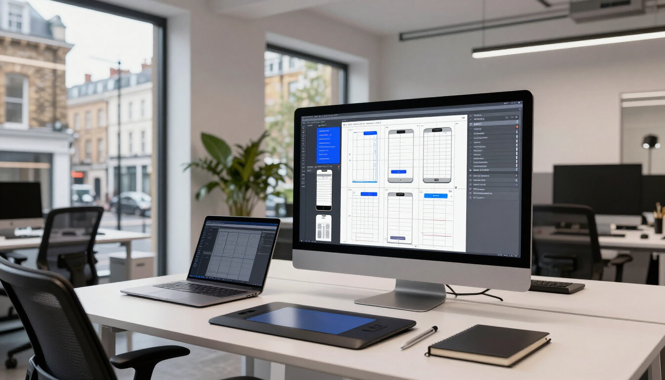
To ensure your Maida Vale business stands out, your responsive strategy must go beyond simple resizing. True responsiveness involves rethinking how information is prioritised on different screens. On a desktop, you might have the space for large hero videos and complex sidebars, but on a mobile device, the focus must shift to immediate action and clear calls to button. This often involves using a "mobile-first" design philosophy, where the core experience is built for the smallest screen and then enhanced for larger ones.
Key technical components of this approach include:
- Fluid Grids: Using percentages instead of fixed pixels for layout elements
- Media Queries: Code that detects the device type and applies specific styles
- Optimised Assets: Scaling images and icons to ensure fast load times
- Touch-Friendly Navigation: Designing menus that work with gestures and taps
- Readable Typography: Ensuring font sizes remain legible without zooming
What role does page speed play in local business success?
Speed is a critical component of responsiveness. A site that is technically responsive but takes ten seconds to load on a mobile connection is still failing the user. In Maida Vale, where people are often on the move, every millisecond counts. Google’s Core Web Vitals specifically measure loading performance, interactivity, and visual stability. If your site’s elements jump around while loading—a common issue in poorly designed responsive sites—your user experience score will plummet. High-speed performance ensures that your Apps or websites provide instant gratification, which is essential for modern consumer retention.
Future-Proofing Your Digital Presence
Technology moves fast. Today it's smartphones and tablets; tomorrow it could be smart glasses or new types of wearable tech. A truly responsive website is built with a flexible architecture that can adapt to future devices without requiring a total redesign. For a medium-sized business in West London, this long-term thinking is vital for budget management. Instead of paying for a new site every two years, a robust responsive framework allows you to make incremental updates as technology evolves. This sustainability is a core part of our consultative approach at the agency, helping you maintain a competitive edge for years to come.
How to evaluate your current website’s mobile performance?
If you aren't sure how your site measures up, start by testing it on multiple devices yourself. Don't just look at the home page; try to fill out a Contact form or find a specific service description. You can also use free tools like Google’s Mobile-Friendly Test to get a technical report. If you find that your site is struggling, it’s time to consider a professional redesign that puts responsiveness at the forefront of your business strategy.
Summary of Responsive Design Benefits
To thrive in the Maida Vale market, your business needs a website that reflects your professionalism and respects your customers' time. Responsive design is the bridge between a visitor and a loyal customer, providing the speed, accessibility, and aesthetic appeal required to win in a crowded digital landscape. By prioritising a mobile-friendly approach, you are not just following a trend; you are building a solid foundation for your brand’s future growth.
Key Takeaways for Maida Vale Business Owners:
- Prioritise Local UX: Ensure your site is easy to use for residents searching on the go.
- Boost Visibility: Use responsive design to secure higher rankings in Google’s mobile-first index.
- Build Trust: Use modern, fluid layouts to create a professional first impression.
- Prevent Loss: Avoid driving customers to competitors by eliminating mobile navigation frustrations.
- Plan for Growth: Invest in a flexible digital architecture that adapts to future technology trends.