


The Complete Guide to Responsive Web Design for West London Companies

4 September 2026

Responsive web design is a strategic development approach ensuring your website automatically adjusts its layout, images, and navigation to fit any screen size. For West London businesses, this technique is essential to provide a seamless user experience, improve local search rankings, and maximize conversions across smartphones, tablets, and desktops.

Why is responsive web design vital for West London SMBs?

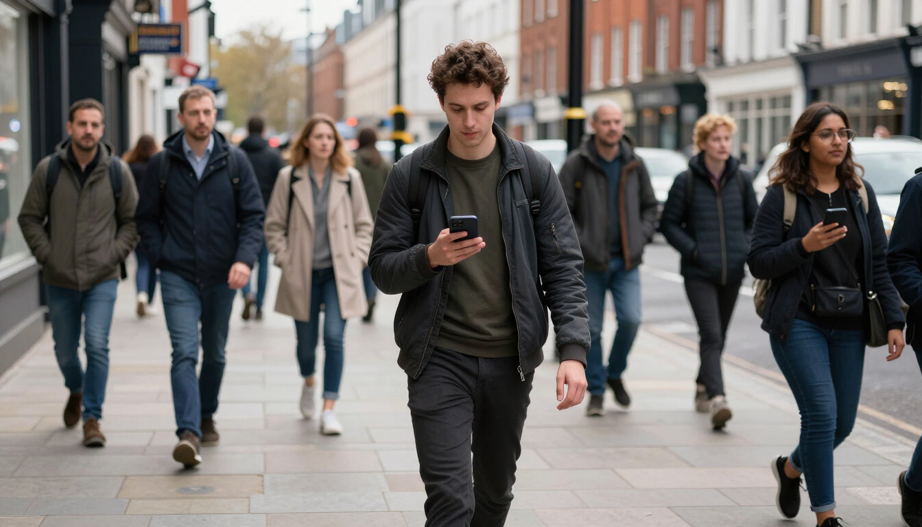
In the competitive commercial landscapes of Maida Vale, Paddington, Notting Hill and other areas in West London, your digital presence is often the first point of contact for potential clients. A responsive website is no longer a luxury; it is a fundamental requirement for business survival. When a local customer searches for services on the move, they expect a site that loads quickly and functions perfectly on their mobile device. If your site is difficult to navigate or requires 'pinching and zooming', users will likely bounce back to search results and choose a competitor.

Modern consumers in West London are increasingly mobile-reliant. Whether they are commuting on the Elizabeth Line or browsing from a cafe in Marylebone, their device of choice is often a smartphone. By investing in professional Websites , small and medium-sized businesses can ensure they meet these customers where they are. A single, responsive site is also more cost-effective than maintaining separate desktop and mobile versions, streamlining your marketing efforts and ensuring brand consistency.

Furthermore, the diversity of devices is constantly expanding. Beyond just iPhones and Androids, we now see a plethora of tablets, foldables, and ultra-wide monitors. A responsive framework uses fluid grids and flexible images to adapt to these varying resolutions automatically. This future-proofs your investment, ensuring that as new devices enter the market, your business remains accessible and professional without the need for constant, expensive redesigns.

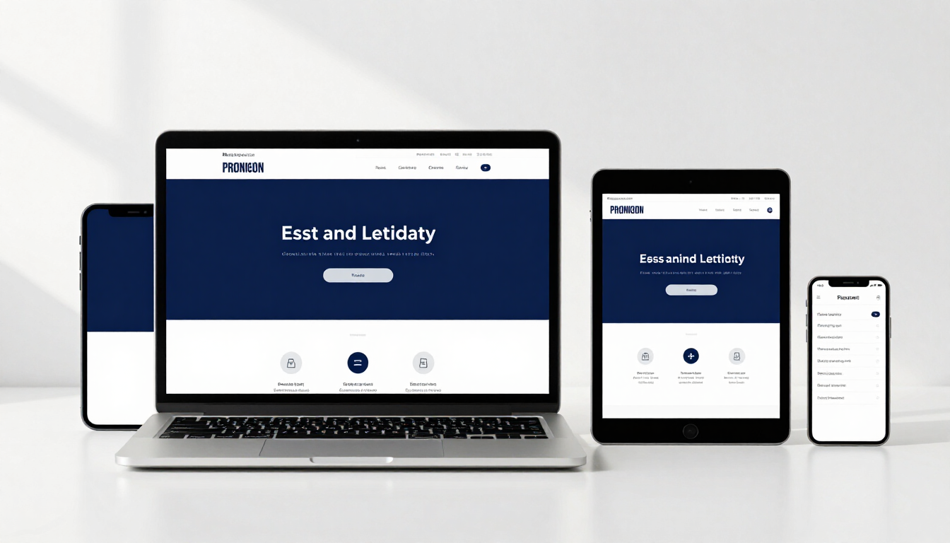
Modern responsive design in London office

Core elements of a mobile-friendly site

Creating a truly responsive experience involves more than just resizing images. It requires a holistic approach to design and development that prioritizes the user's needs at every touchpoint. When building high-performing Websites , several core elements must be harmonized to create a site that feels native to every device it inhabits.

Key components of effective responsive design include:

  • Fluid Grids: Layouts built with relative units (like percentages) rather than fixed pixels.
  • Flexible Images: Media that scales within its containing element to prevent overflow.
  • Media Queries: CSS rules that apply different styles based on device characteristics.
  • Touch-Friendly Navigation: Buttons and links spaced adequately for finger taps.
  • Optimised Typography: Font sizes that remain legible on small screens without excessive scrolling.

How does responsive design improve local SEO rankings?

Search engine optimization is heavily influenced by how well your site performs on mobile. Google predominantly uses the mobile version of a site's content for indexing and ranking, a process known as mobile-first indexing. If your West London business lacks a responsive design, your visibility in local search results will likely suffer, making it harder for customers in your immediate area to find you.

Beyond just indexing, responsive design improves several key SEO metrics. Site speed is a critical ranking factor; responsive sites that are properly optimized tend to load faster than bloated, non-responsive counterparts. Additionally, a single URL for both desktop and mobile users prevents issues with duplicate content, which can happen if you have a separate 'm.example.com' site. This consolidation makes it easier for Google’s algorithms to crawl, index, and understand your site’s structure and authority.

User engagement signals also play a role in SEO. High bounce rates—which often occur when mobile users struggle with a desktop-only site—signal to search engines that your page may not be relevant or helpful. Conversely, a responsive site encourages longer dwell times and higher click-through rates. By providing a superior user experience, you satisfy both the human visitor and the search engine algorithm, creating a virtuous cycle that lifts your rankings over time.

Mobile SEO optimization for local business

Designing for the West London consumer

West London is home to a sophisticated demographic that values efficiency, aesthetics, and clarity. From boutique retailers in Notting Hill to professional service firms in Mayfair, the expectations for digital quality are high. Responsive design allows you to tailor the visual hierarchy of your site based on the user's context. For instance, a mobile user might need immediate access to your 'Contact' button or a 'Click to Call' feature, whereas a desktop user might be more interested in reading long-form case studies or viewing detailed galleries.

To effectively serve this audience, your design must be 'thumb-friendly'. This means placing the most important interactive elements within easy reach of a user's thumb when they are holding their phone with one hand. In the busy streets of West London, people are often multitasking. If your site makes it difficult for them to find your address or book an appointment while they are walking, you have missed a conversion opportunity. Simplification is the ultimate sophistication in responsive design; stripping away unnecessary clutter on smaller screens ensures your core message remains front and center.

What are the technical benefits of a fluid grid?

A fluid grid is the backbone of any responsive website. Unlike traditional fixed-width layouts, a fluid grid uses proportional dimensions to define the width of columns and containers. This means that instead of saying a column is '400 pixels wide', we say it is '33% of the screen width'. This flexibility is what allows a website to flow like water, filling whatever container it is poured into.

Technical advantages of this approach include:

  • Seamless Transitions: No 'breaking points' where the layout looks awkward between sizes.
  • Reduced Maintenance: One codebase to update for all devices and platforms.
  • Improved Performance: Efficient CSS reduces the amount of code the browser must process.
  • Accessibility: Better support for screen readers and users who zoom in for legibility.
  • Consistency: A unified brand experience across every possible user touchpoint.

Implementing a fluid grid requires a deep understanding of modern CSS techniques such as Flexbox and CSS Grid. These tools allow developers to create complex, dynamic layouts that remain stable and performant. For businesses in Central and West London, partnering with an agency that understands these technical nuances is the best way to ensure your digital storefront reflects the quality of your physical services. Whether you are looking for new Websites or an audit of your current site, focusing on responsive technical foundations is the smartest path forward.

Key takeaways for your digital strategy

Adopting responsive web design is a critical step for any West London business aiming to grow in a digital-first economy. By ensuring your site is accessible, fast, and user-friendly on every device, you remove the barriers between your services and your potential clients. A responsive approach simplifies your management tasks, boosts your SEO performance, and provides a professional image that resonates with the local community.

  • Prioritise Mobile: Always design with the mobile user's context and constraints in mind.
  • Invest in Quality: Use professional Websites services to ensure technical excellence.
  • Monitor Performance: Regularly check your site's speed and usability on various devices.
  • Local SEO Focus: Leverage responsiveness to climb the rankings in West London search results.
  • Future-Proof: Use fluid layouts to stay ready for the next generation of mobile devices.

Share this article:

Recent Posts

A modern responsive website design shown on multiple devices in a London office setting.
14 September 2026
Learn how responsive websites for Paddington businesses increase traffic and customer engagement. Explore essential mobile-friendly design and SEO tips for London SMBs.

AI-powered digital marketing strategy data visualisation for London businesses
11 September 2026
Master your digital marketing with an AI-powered content strategy. Learn how Central London SMBs use AI to rank higher, engage local audiences, and grow in 2026.
Digital marketing team discussing SEO strategy in a Maida Vale office.
9 September 2026
Learn how to boost your visibility with search engine optimisation for Maida Vale. This guide helps West London businesses attract local customers and rank higher.

Modern office setting in Paddington London representing business growth and digital development.
7 September 2026
A comprehensive guide for Paddington SMEs on building mobile apps, covering strategy, design, development, and launch in the West London market.
A picturesque canal scene in Maida Vale, London, representing the local community.
1 September 2026
Boost your local reach with our guide to content marketing for Maida Vale businesses. Learn how blogs and social media drive growth in London W9.
Paddington London street scene with local shops
27 August 2026
Master local SEO strategies for Paddington businesses. Learn to rank higher on Google using location-specific tactics, GBP optimization, and local backlinks in West London.
A professional setting in West London showing a mobile app development project in progress.
25 August 2026
Discover how West London businesses are boosting revenue and customer loyalty through custom mobile app development. A 2026 guide for local SMEs.
Responsive website displayed on a mobile phone in Central London
20 August 2026
Ensure your Central London business thrives in 2026 with a responsive website. Learn how mobile-friendly design boosts SEO, UX, and local growth.